

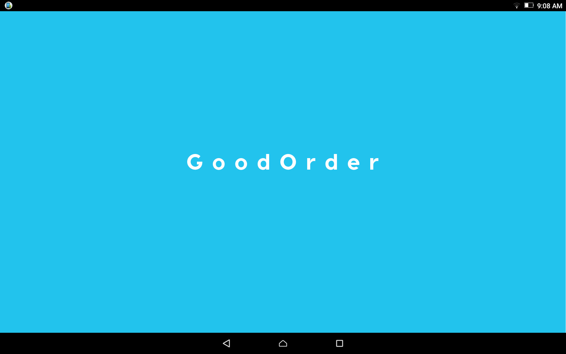
GoodOrder Case Study
Health care should be personable, straightforward and empathetic. If you’ve been to see a doctor recently, (or just read the news), you’ll know that it’s anything but.
GoodOrder was conceived as a meal-ordering service for hospitals. Its goal is simple: to make things easier for patients who are already in a compromised position, and for hospital staff, who dedicate an inordinate amount of time to something so seemingly trivial.
In our research, we learned that the two most common forms of hospital meal ordering are call-centers and staff-managed ordering, both of which consume 200 staff hours or more per week! This is hundreds of hours that nurses and hospital staff could be spending on patient care, instead of taking orders and delivering meals.
The few software-based solutions already in the market were either on large rolling carts (ever used a desktop PC in bed?) or through smart TVs (text entry via TV remotes makes me shudder just thinking about it).
Initial Challenges
One of the initial challenges we ran into was that the app had to seamlessly integrate with the service provider's current software. This meant that there would be constraints to the design process, at least in the beginning stages.
This actually proved beneficial, because it encouraged us to familiarize ourselves with the current processes, and we ended up in a better position to solve problems for the user.
Over 200 hours per week are spent on meal-ordering and delivery, time that could be better spent on patient care.

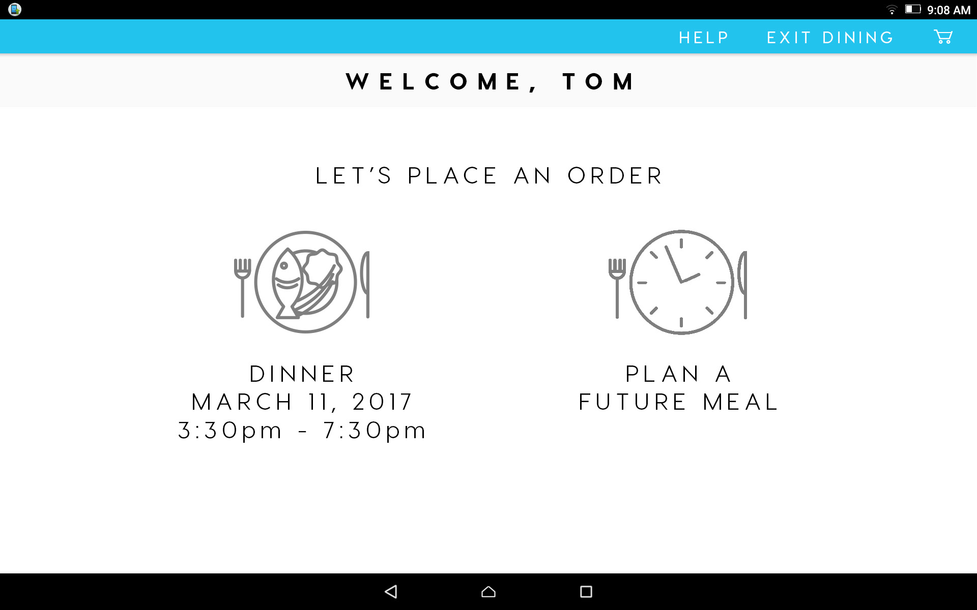
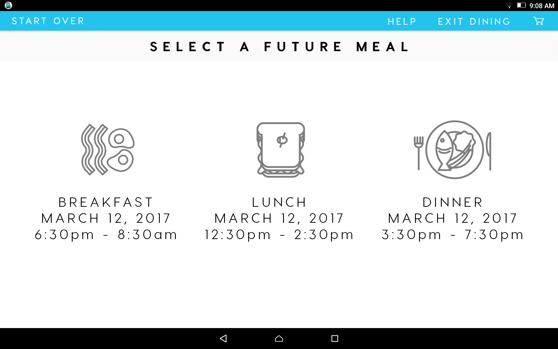
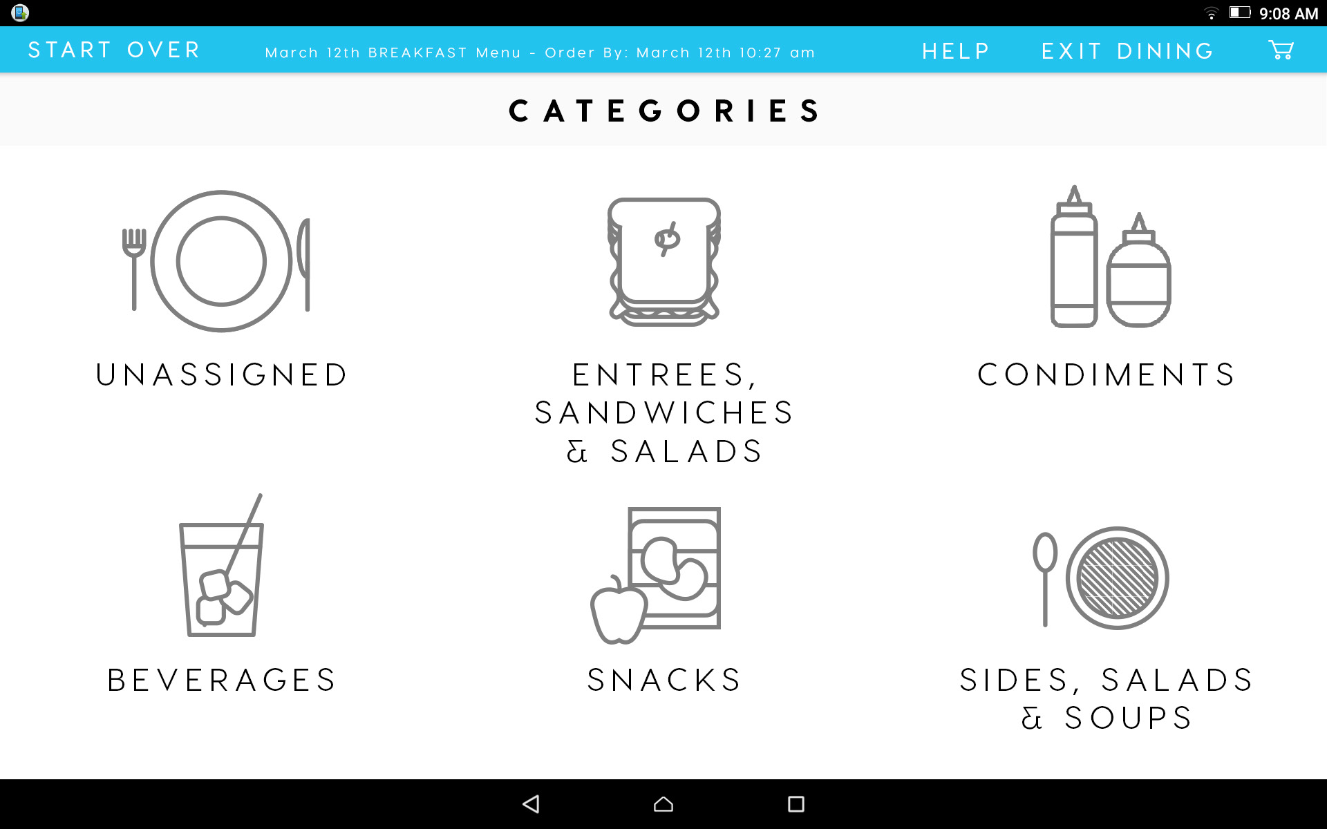
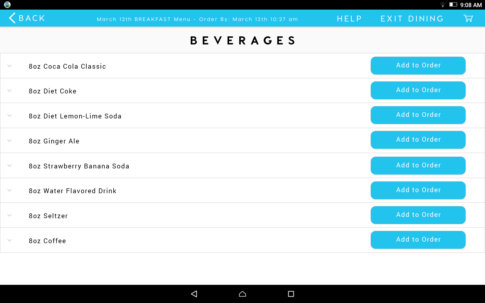
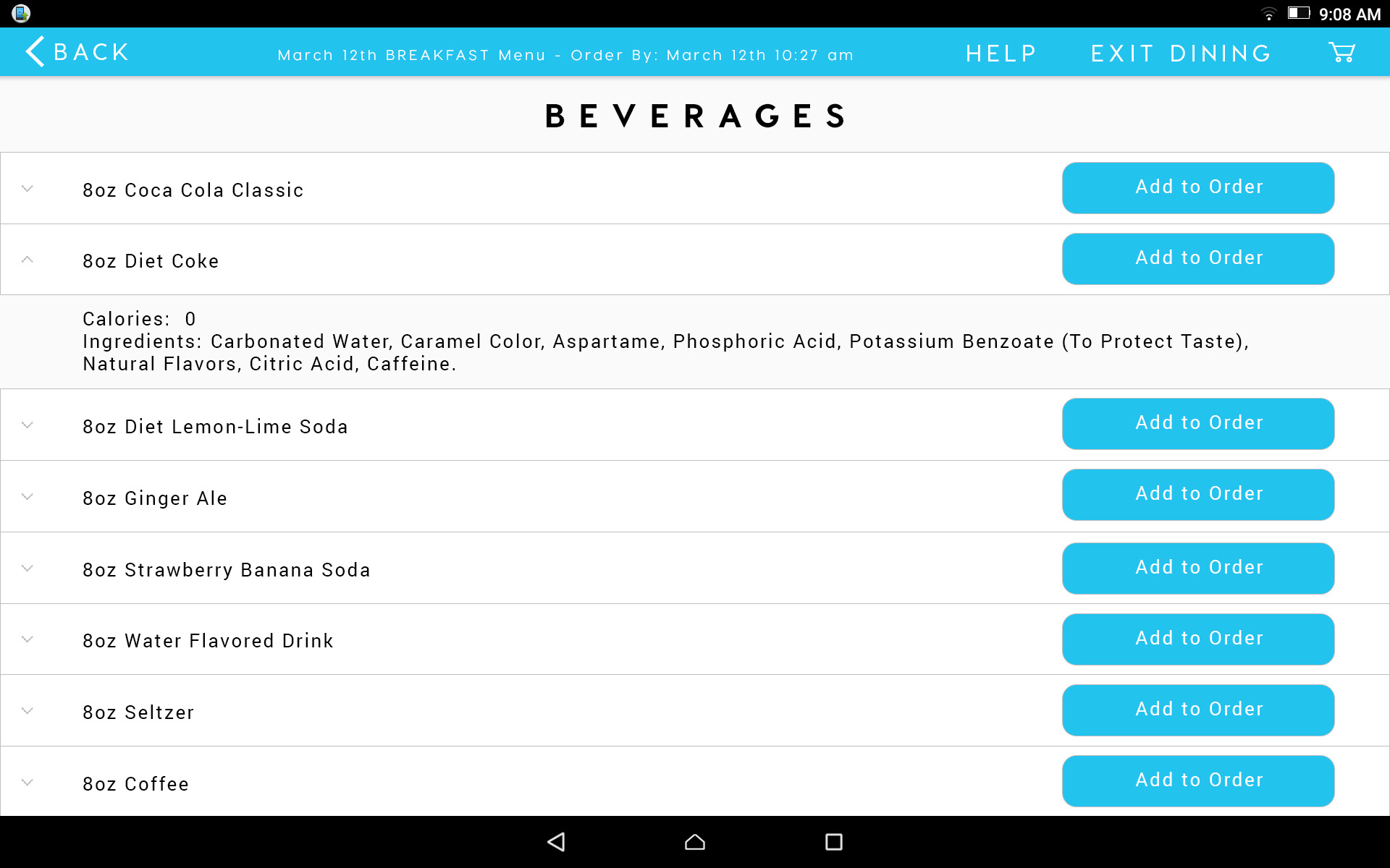
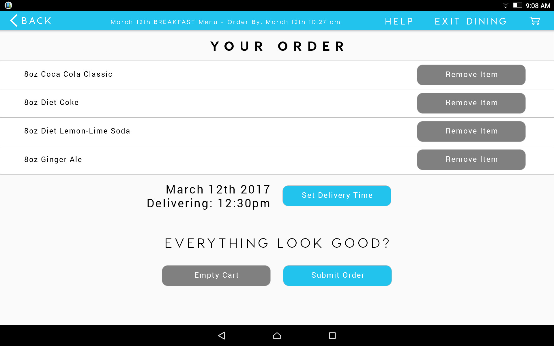
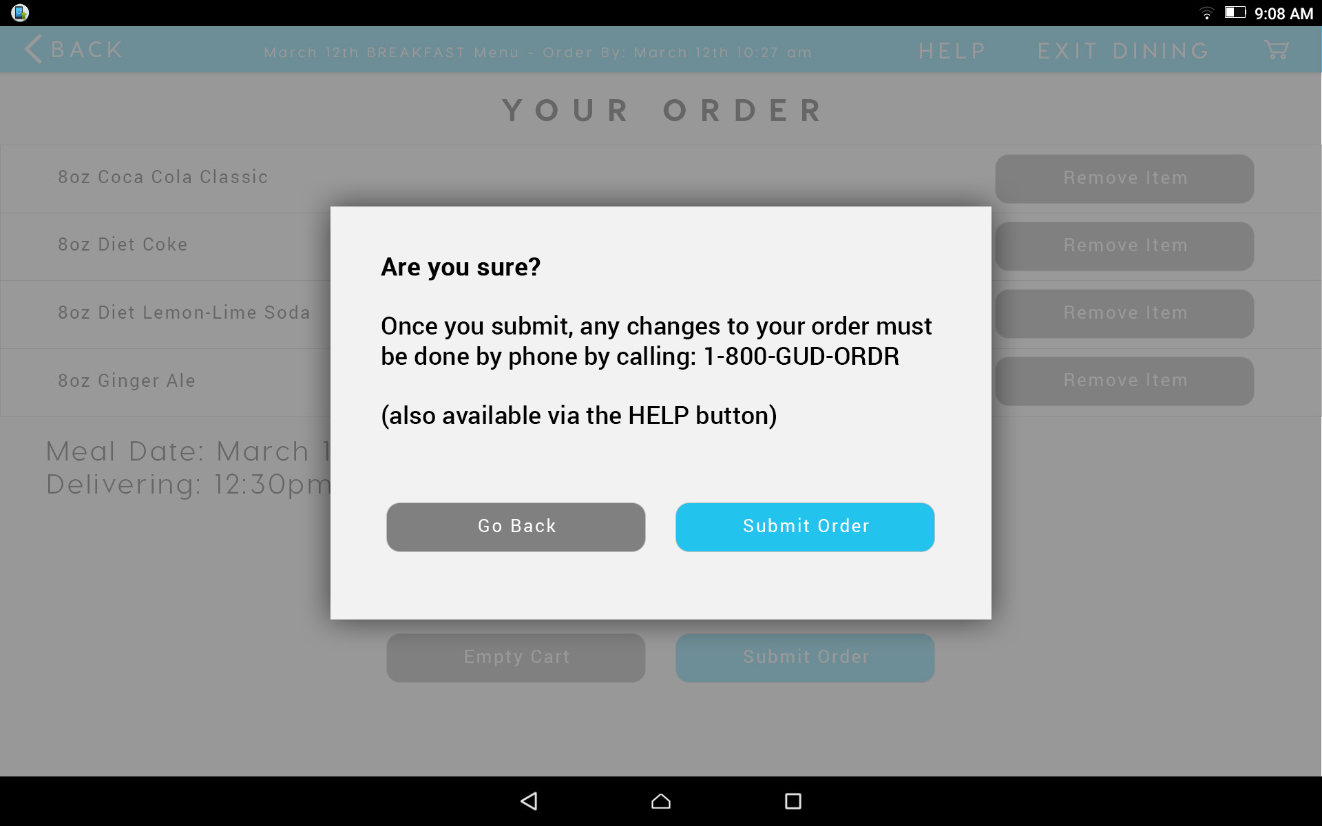
Can Grandma Use It?
We knew that many patients would be struggling with a temporary or permanent disability, and would most likely be seniors. Being the designated IT people for our own families, we've seen firsthand the frustration and confusion seniors can have with modern tech, not to mention the additional struggles caused by pain or medication side-effects. Therefore our design and experience would need to be even simpler and cleaner than usual.
Our users will probably already be disoriented or in pain when they start to use the product. We cannot expect them to search for, download, and install an app, then spend the time to learn how our interface works.
Being my first UI layout, and having not yet learned about the joy of Sketch, I designed every page as an artboard in Photoshop. It may have been a bit clunky, but it allowed me to logically and rapidly lay out an order sequence and make quick changes as we progressed.
Our goal should be for the customer to spend as little time as possible with our product.

A Useful Exercise
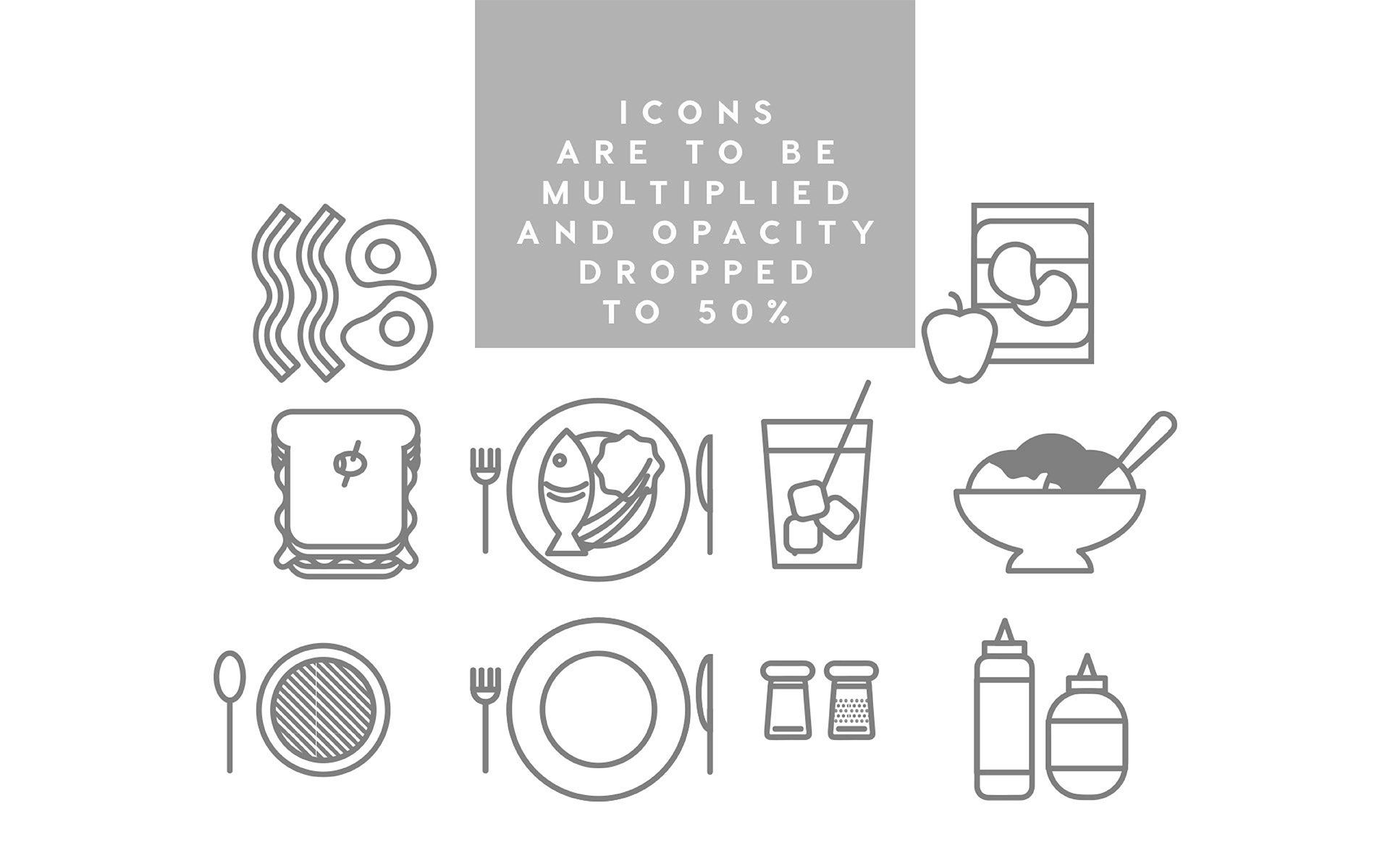
Our strategy was to center the interface around large, easily identifiable icons and simplifying the user flow as much as possible.
GoodOrder is still in development, and we are looking forward to rolling out systems for testing in select hospitals nationwide.
